• Illustration
  • Identity
  • Music
  • Publications
  • Photography
    • Pittsburgh
    • Travel
    • Music
  • About
Michael Artman
  • Illustration
  • Identity
  • Music
  • Publications
  • Photography
    • Pittsburgh
    • Travel
    • Music
  • About

The Branding Iron // USA Today

While I never really saw USA today as a newspaper, the fact is that they were the second biggest distributor of news in the United States. While it always had more of a news magazine flair, the commonly known identity set it apart from the thousands of other newspapers using traditional serif or blackletter type for their mastheads.

I'm not a fan of this old branding. It always felt dated to me, and even if it was the freshest logo on the block, I would not be able to get behind it for a number of reasons. The horribly inconsistent and cramped letter-spacing, the ugly unnecessary trademark symbol that acts as a period, and that globe icon that shows a lot more than the USA which contradicts the namesake... these are all things that make my head hurt. If any publication was in need of a makeover, it was USA Today, so when a big name like these guys announced they would be rebranding, I was certainly interested to see what a newspaper of the 21st Century might look like.

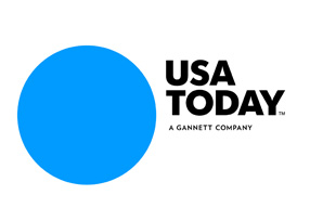
This is the best they could come up with? Using the latest design trend? As many of us have seen, having a dynamic logo that can take a number of forms is the new kid on the block. Everyone wants to be buddies with the new guy. The new guy is so clever and witty! This bland mark for the paper's update can take just about any form. See the detail below:

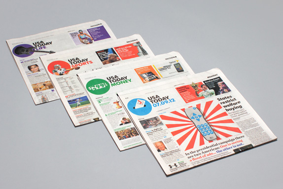
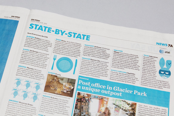
In my mind, this style of design is lazy design. Sure, it might take a lot of work to set up the styles and guidelines for this type of branding, but it requires no thought. No one is sitting down thinking "what is the one perfect mark we can create to make people buy into this brand". It is lazy because there is no design work - anything can be the USA Today logo. Who knows, maybe there is more to it than that. Im sure there is, and I am just looking ignorant, but regardless, I can at least say that I am not a fan. I do however, applaud the designers for at least having the sense to add some much needed spacing between those letters. They needed some room to breathe, and speaking of breathing, what a sigh of relief to see someone using Futura instead of Gotham on a redesign. Another applaud I can give these folks is for nice balance. All too often the weight is too heavy towards the icon or the wordmark, and the eye gets confused. Here, we've got a pretty concise, unified identity with elements that play nice with one another. But, I've got just enough time for one more complaint to finish things off here - why does USA Today, or any newspaper/magazine need anything more than a wordmark at all? Look at how great their new identity looks within the pages of the paper. Bold headlines, bold colors... why not get rid of that silly circle? Typography is a huge problem in many papers, and these folks nailed it.

categories: Identity, Graphic Design, Branding
Wednesday 09.19.12
Posted by Michael Artman
 

The Branding Iron // State Farm

Being arguably the most famous logo designers in the world is not an easy task. The more press one gets, the more people expect greatness. After so much greatness, even your not so great work can easily be heralded as top notch. Even the best of the best sometimes miss the mark... even if no one seems to notice. Chermayeff & Geismar are the folks behind iconic logo masterpieces such as Chase, National Geographic, Mobil, NBC, Harper Collins, Pan Am... and on and on. Even as time wears on, new talent is brought aboard to keep the company fresh. Since recent partner Sagi Haviv joined the team, we have seen beautiful work for the Library of Congress, Armani Exchange, and Conservation International. Unarguably great design work. Let's make this clear. I am not normally one to say "I could have done better myself". It is hard to say that when you are not the one that sat through the meetings, talked with the clients for endless hours, and studied all the ins and outs of the company for days on end. But I do have a hard time believing that the new identity for State Farm is the best Chermayeff & Geismar can do.

Here is what was nice about the old logo (pictured above): I have been a State Farm customer for years now, and personally had no idea the company ranked #37 on the Fortune 500. To me, a guy who usually does judge a book by its cover, the old logo comes off as a small town brand, and rightfully so. The somewhat dated feel of the icon made State Farm completely unique from the other insurance industry giants such as Nationwide and Geico, just to name a few. This logo, which hasnt changed much since my parent's parents bought their first insurance plans, always made me feel like someone out there cared about me. It takes me back to a time when values still meant something... even in the corporate world.

I can see why State Farm felt the need to freshen up. Not only do their own views toward themselves not necessarily line up with my own, but this old mark clearly reads "Auto, Life, Fire" contained within the small ovals. Understandably, in the modern world, their coverage has evolved past that simplistic 3 part model. So fast forward to 2012, and this is what we see:

To most, the change might not look like much. Simplified.. cleaned up.. largely familiar. But it is how simple it is that bothers me most. I don't like how familiar it feels compared to those other insurance companies. The new mark feels lifeless, and above all, corporate. Once past the general aesthetic, the logo doesn't fare any better in my mind. I miss how cleanly the old ovals flowed in to one another. They had a very continuous rhythm which conveyed the sense of lumping all your insurance into one provider. The new ovals are awkwardly spaced, and really, appear all too separate. Upon close examination, the stroke's edges are hardly touching... where in the past, all three ovals shared the same stroke.

Although disappointed to see my long time insurance company get this updated look, I can't say that it is all bad. If you take the time to look at the logo in use - on mobile apps, websites, etc. - it fits in well. While I may not like it, it serves it's purpose. To many, I am sure it comforts consumers to know that their company is still competitive. Outside the super-picky, I can only imagine that most see this new design as yet another home-run for Chermayeff & Geismar... or if not a home-run, at least a nice double batted into left field.

categories: Graphic Design, Branding
Tuesday 01.10.12
Posted by Michael Artman
 

The Branding Iron // Starbucks

While shuffling through the daily news, a startling headline caught my eye: "Starbucks Unveils New Logo".

In the midst of recent, and tragic, rebrands of many global companies,  us consumers are almost at the point where we shutter in fear at the words "new logo".  It seems to have been quite some time since a global brand rolled out a new look that was largely successful.

The problem with coming out with a new look once you are an established global brand lies in customer recognition and familiarity.  Changing the game tends too alienate the very people you are trying to please... the consumers.  These brands have become so successful because people remember their brands and continue to use them.  Once changed, people may begin to think that the quality of the company has also changed.  Most of the world does not accept change very readily, so it obviously comes along with its fair share of risks.

Not necessarily a lover of Starbucks (I used to be before my girlfriend got a job at a Starbucks rival), as a designer, I have always been able to respect the quality of the Starbucks image.  This is the result of millions of dollars spent to make them one of the most recognizable companies in the world.  Unfortunatly, in recent years, Starbucks has been seeming to revisit the past.  Going for a vintage look, bringing the word "tradition" back into the coffee experience, we have seen Starbucks using old versions of their siren logo since 2008.

Although the new/old look seems to have never fully caught on, it has been seen on various packaging on the coffee giants products.  The logo has taken a lot of flak, primarily for the naughtiness of the nude siren illustration.  It seems odd that Starbucks would go back to that look after spending so much to clean up their image.

Worse yet, are more recent rumors of a new siren that was being seen on packaging.  This siren (pictured below) has an even more illustrative quality, and is obviously not logo material.  I doubted the rumors of this being used as a logo, but stranger things have happened.

So today, as I hear of this new Starbucks logo, I feared the direction that the company was taking.  It has been 40 years since the company had started, and if there is anything that usually ends in disaster, are anniversary marks.  They normally are an under-thought revitalization of an original mark.  The perfect excuse for Starbucks to abandon years of quality marketing to use their old naked siren full time once again.

Luckily for us, rumors had once again been wrong, and Starbucks actually made a leap into the future.  The move is almost trendy in a sense, but trendy things must go out of style, and I cannot picture anything of this caliber going of of style.

Rather than trendy, I see this current move of brands getting stripped down as a renaissance in logo design... A revitalization of the ideals that came out of the great iconic brands of the 50's and 60's.

Starbucks was never one of the brands that took on the trendy look of the times.  Their look as always been iconic.  I never expected their identity to be capable of being stripped down further.  But I was wrong.

Removing elements from your design always help make it more recognizable.  The simpler the icon, the easier it is for viewers to recognize.  So here you have it.. the new simplified look of Starbucks.

categories: Graphic Design, Branding
Wednesday 01.05.11
Posted by Michael Artman
Comments: 1
 

© 2010-2025 Michael Artman