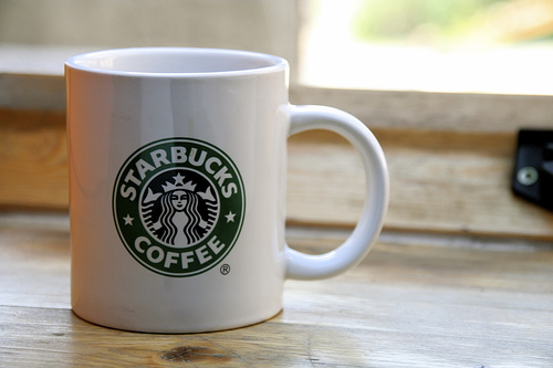
While shuffling through the daily news, a startling headline caught my eye: "Starbucks Unveils New Logo".
In the midst of recent, and tragic, rebrands of many global companies, us consumers are almost at the point where we shutter in fear at the words "new logo". It seems to have been quite some time since a global brand rolled out a new look that was largely successful.
The problem with coming out with a new look once you are an established global brand lies in customer recognition and familiarity. Changing the game tends too alienate the very people you are trying to please... the consumers. These brands have become so successful because people remember their brands and continue to use them. Once changed, people may begin to think that the quality of the company has also changed. Most of the world does not accept change very readily, so it obviously comes along with its fair share of risks.
Not necessarily a lover of Starbucks (I used to be before my girlfriend got a job at a Starbucks rival), as a designer, I have always been able to respect the quality of the Starbucks image. This is the result of millions of dollars spent to make them one of the most recognizable companies in the world. Unfortunatly, in recent years, Starbucks has been seeming to revisit the past. Going for a vintage look, bringing the word "tradition" back into the coffee experience, we have seen Starbucks using old versions of their siren logo since 2008.
Although the new/old look seems to have never fully caught on, it has been seen on various packaging on the coffee giants products. The logo has taken a lot of flak, primarily for the naughtiness of the nude siren illustration. It seems odd that Starbucks would go back to that look after spending so much to clean up their image.
Worse yet, are more recent rumors of a new siren that was being seen on packaging. This siren (pictured below) has an even more illustrative quality, and is obviously not logo material. I doubted the rumors of this being used as a logo, but stranger things have happened.
So today, as I hear of this new Starbucks logo, I feared the direction that the company was taking. It has been 40 years since the company had started, and if there is anything that usually ends in disaster, are anniversary marks. They normally are an under-thought revitalization of an original mark. The perfect excuse for Starbucks to abandon years of quality marketing to use their old naked siren full time once again.
Luckily for us, rumors had once again been wrong, and Starbucks actually made a leap into the future. The move is almost trendy in a sense, but trendy things must go out of style, and I cannot picture anything of this caliber going of of style.
Rather than trendy, I see this current move of brands getting stripped down as a renaissance in logo design... A revitalization of the ideals that came out of the great iconic brands of the 50's and 60's.
Starbucks was never one of the brands that took on the trendy look of the times. Their look as always been iconic. I never expected their identity to be capable of being stripped down further. But I was wrong.
Removing elements from your design always help make it more recognizable. The simpler the icon, the easier it is for viewers to recognize. So here you have it.. the new simplified look of Starbucks.


