• Illustration
  • Identity
  • Music
  • Publications
  • Photography
    • Pittsburgh
    • Travel
    • Music
  • About
Michael Artman
  • Illustration
  • Identity
  • Music
  • Publications
  • Photography
    • Pittsburgh
    • Travel
    • Music
  • About

Flirt with trends, dont be trendy.

While I normally try to avoid trends completely, sometimes a project calls for a design style that falls in line with what currently happens to be trendy. Other times, you purposefully want a trendy look in order to compete, such as in fashion... because obviously, what is in style right now is what sells product. No one is making much money off bolo ties these days, are they? 

But problems arise when popular aesthetic changes, and your work becomes dated. This is especially apparent in the tech and web industries in my opinion, simply because those industries are advancing at light speed (Someone, please invent a spaceship that can go light speed).

So what's the trick to appearing fresh when you launch a project, but having your hard work stay relevant for decades? Flirt with the trends, but dont be trendy.

By all means, use that color that everyone loves right now. But while you are at it, open up an old design book. Study the GE logo. Study the Nabisco or the AT&T logo. Learn the masters. When you understand the principles of a timeless design, it doesn't matter what the current trend is. A great design can be used in any setting and take advantage of any trend. Sit down and actually thinking about what it is that people like, rather than just giving it to them no questions asked. A thoughtful designer can always find a way to capitalize on what is popular without sacrificing those tried and true rules. It's all about figuring out what people really want. When you hit the mark, they won't even notice that your work isn't trendy, nor will they care.


categories: Graphic Design
Wednesday 10.31.12
Posted by Michael Artman
Comments: 2
 

Copyrights

Stealing artwork is nothing new by any means, but recently, I've seen a number of high profile designs get blatantly ripped off by not-so-subtle thieves. Unfortunately, the way that copyright law is written in the US, it is very hard to protect your own artwork, as long as the thief is either in a different industry than you, or if the theft does not bring much profit. In each of the three cases I've seen this month, the circumstances were quite different. In the first, involving a local screen-print shop and a large media company, a newspaper had taken an illustration drawn by the screen printers, removed the logo, and was printing that same illustration on free handouts to the public.

In a second instance, an extremely popular video game company published an illustration that was stylistically similar to a very famous poster designer, and actually used one or two of the exact same elements from the artist's most famous poster.

And finally, in a third case, a well-known illustrator found one of his pieces (originally drawn for a HUGE athletic brand), traced to nearly 100% accuracy for sale on a stock-vector graphics site.

As far as I know, in none of these cases was any legal action taken. And while some folks are up in arms about how artists need to fight for their copyrights, unfortunately it is usually an impossible battle. In every case here, the thief was actually a much larger company, complete with much larger legal teams, that could easily bankrupt any self-employed artist through the long drawn-out process it takes to fight these things. Additionally, is it really in our best interest to fight such thefts? Maybe we, as artists, are better off in a world where stolen art is not only brushed under the rug and ignored, but commonplace. Of the millions of companies in the world, what are the chances that the last logo you sold to a client is somewhat similar to a design someone else created years ago? How many folks would be left in our industry if every single design we tried to publish, or every idea we tried to convey, or every style we used had to be 100% original?

The bottom line is that we, as artists, borrow things. Since there isnt a clear line drawn in the sand between borrow and steal, it is hard to ban one thing, without banning the other. So I applaud artists who continually let their artwork to be stolen, and take it in stride. It is going to happen to all of us. Someday, something you have done will be stolen, or borrowed by another artist, or at the very least, your work is going to inspire someone else's work. I'm sure it is infuriating, or even frustrating, that some people can't do their own thing. By all means, send a seize-and-desist over that blatant theft... but then take a good hard look at your own work, and realize how you got to where you are today thanks to the work of others.

categories: Copyright, Graphic Design, Legal
Friday 09.21.12
Posted by Michael Artman
 

The Branding Iron // USA Today

While I never really saw USA today as a newspaper, the fact is that they were the second biggest distributor of news in the United States. While it always had more of a news magazine flair, the commonly known identity set it apart from the thousands of other newspapers using traditional serif or blackletter type for their mastheads.

I'm not a fan of this old branding. It always felt dated to me, and even if it was the freshest logo on the block, I would not be able to get behind it for a number of reasons. The horribly inconsistent and cramped letter-spacing, the ugly unnecessary trademark symbol that acts as a period, and that globe icon that shows a lot more than the USA which contradicts the namesake... these are all things that make my head hurt. If any publication was in need of a makeover, it was USA Today, so when a big name like these guys announced they would be rebranding, I was certainly interested to see what a newspaper of the 21st Century might look like.

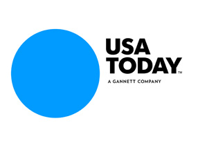
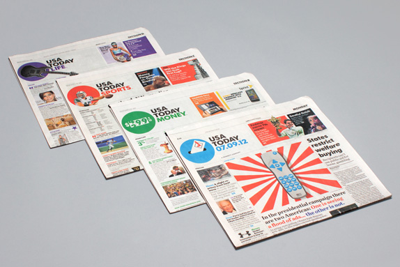
This is the best they could come up with? Using the latest design trend? As many of us have seen, having a dynamic logo that can take a number of forms is the new kid on the block. Everyone wants to be buddies with the new guy. The new guy is so clever and witty! This bland mark for the paper's update can take just about any form. See the detail below:

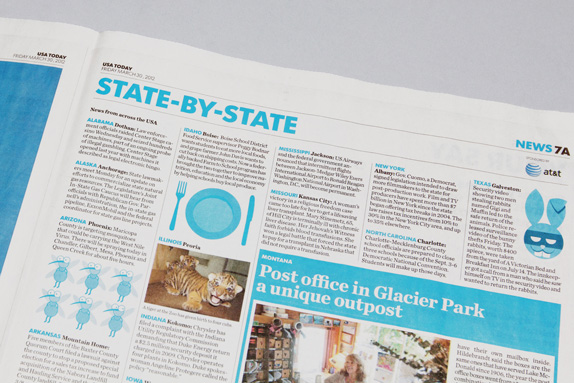
In my mind, this style of design is lazy design. Sure, it might take a lot of work to set up the styles and guidelines for this type of branding, but it requires no thought. No one is sitting down thinking "what is the one perfect mark we can create to make people buy into this brand". It is lazy because there is no design work - anything can be the USA Today logo. Who knows, maybe there is more to it than that. Im sure there is, and I am just looking ignorant, but regardless, I can at least say that I am not a fan. I do however, applaud the designers for at least having the sense to add some much needed spacing between those letters. They needed some room to breathe, and speaking of breathing, what a sigh of relief to see someone using Futura instead of Gotham on a redesign. Another applaud I can give these folks is for nice balance. All too often the weight is too heavy towards the icon or the wordmark, and the eye gets confused. Here, we've got a pretty concise, unified identity with elements that play nice with one another. But, I've got just enough time for one more complaint to finish things off here - why does USA Today, or any newspaper/magazine need anything more than a wordmark at all? Look at how great their new identity looks within the pages of the paper. Bold headlines, bold colors... why not get rid of that silly circle? Typography is a huge problem in many papers, and these folks nailed it.

categories: Identity, Graphic Design, Branding
Wednesday 09.19.12
Posted by Michael Artman
 
Newer / Older

© 2010-2026 Michael Artman