• Illustration
  • Identity
  • Music
  • Publications
  • Photography
    • Pittsburgh
    • Travel
    • Music
  • About
Michael Artman
  • Illustration
  • Identity
  • Music
  • Publications
  • Photography
    • Pittsburgh
    • Travel
    • Music
  • About

Olympic Gold

With the 2012 Olympic Games rapidly approaching, I keep seeing that monstrosity of a logo all over the place. Olympic Games are notorious for having badly designed logos, or at least boring uninspiring logos. I decided to take a look at the history of Olympic logos, and share my 3 favorite as well as my 3 most hated (aside from this year's logo).

Starting with my 3 least favorite (again, aside from this year's design):

The '72 Munich logo is certainly a love/hate for me, as I personally love the design and aesthetic of the piece. However, I am a firm believer that Olympic logos should contain the Olympic rings (I believe they are required to now-a-days) Although this is a great eye-catching design, when viewed out of context, I would really have no idea what it was for. Its a shame to see a great design be so un-useful.

My second selection is the '72 Sapporo Winter Games logo. None of the elements individually irk me, but I think the obvious question is where are they going with this? Is it just me, or is this 3 separate logos glued together. Additionally, that stroke rubbing the Olympic rings and the type is just all too touchy-feely for my likes.

Finally we've got the '94 Lillehammer Games. Not much to be said outside of mentioning that it certainly looks like a logo that would pop up prior to a movie I am watching.. and I don't think Lillehammer is in the film production biz. Again, not terrible work.. but it doesnt make any sense to me.

Picking my 3 favorite was a bit easier. Certainly a smaller selection to choose from, and these 3 were the big winners:

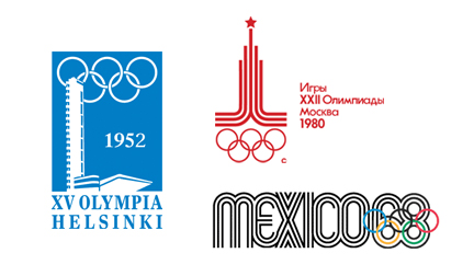
The '52 Helsinki Summer Games is a wonderful logo that manages to stay simple and capture the uniqueness of the city at the same time. My only concern is that the color makes it feel very "winter" to me... or maybe it is the fact that I never considered Finland a particularly "summer" country. Feeling cold or not, the simplicity is enjoyable - and I bet it would look great on a stamp.

Next, I chose the '80 Moscow Games. I simply love the Cold War era design. I find the logo a bit humorous, as can't help but think that the star at the top represents the Soviet Union as a  super-power... rather than representing the spirit of the game and a podium. Regardless of intent, this is one of the few Olympic logos I've seen that actually reminds me of competition and sport.

Last but not least is the '68 Mexico logo. It is hard not to include a design that has prompted so many positive reviews in the design community. I can't say I love it as much as most, but it really is about as close to actual design that anyone has come regarding Olympic logos. Eye-catching and original to say the least.

categories: Identity, Graphic Design
Friday 01.13.12
Posted by Michael Artman
Comments: 1
 

Bass Fishin'...

Saul Bass is widely regarded as perhaps the best graphic artist of the 20th Century due to his extremely popular motion picture title sequences and posters, as well as his undeniably iconic logo designs. While many of his now famous designs have gone by the wayside as companies expanded, folded, merged, etc., we are still bombarded with Saul's work on a daily basis. I was reminded of this this past week, as a coworker sent out an email regarding the sale of Girl Scout cookies. Saul Bass' Girl Scouts logo has withstood the test of time (mostly - subtle changes have been made) and has been in use for well over 30 years now. The great use of negative space makes it one of my favorite logos I have seen, which got me to thinking - what is my absolute favorite Saul Bass logo? Do I have to pick just one? That is a hard crop to choose from... almost every one I would consider a masterpiece. The standouts include Alcoa, AT&T, Avery, Bell, Continental, Dixie, Exxon, Kleenex, Lawry's, Minolta, and Quaker... just to name a few. My personal favorite? United Airlines.

The United Airlines logo may not be his most original or even his most eye catching design, but when the industry is taken into perspective, United has no competition in my mind. The design just makes sense. A stylized letter "U", the angle of the slanted lines fits perfectly onto the tail of a jet. Maybe it is the usage in general that makes this logo so great in my mind. Something about a design standing over 30 feet tall on the side of a jumbo jet has a certain appeal. The spacing of the parallel lines in combination with the curves of the letter-form create the perfect shape to convey a sense of flight, travel and movement. And who can not love an American made logo on an American made plane that is comprised of red, white and blue with stripes reminiscent of the American flag?

Unfortunately, the design was phased out after 37 years in 2010 as Continental and United merged, and was replaced by the much less inspiring globe icon. Ironically, before Continental adopted the globe icon in the 90's, they too had a pretty nifty Bass logo. But perhaps being replaced by a lesser design makes Bass' work stand out even more.

Although many of Saul Bass' creations have disappeared over the years, there are still plenty out there still in use to remind us of the great artist that he was, and his work will continue to inspire.

categories: Graphic Design
Wednesday 01.11.12
Posted by Michael Artman
 

The Branding Iron // State Farm

Being arguably the most famous logo designers in the world is not an easy task. The more press one gets, the more people expect greatness. After so much greatness, even your not so great work can easily be heralded as top notch. Even the best of the best sometimes miss the mark... even if no one seems to notice. Chermayeff & Geismar are the folks behind iconic logo masterpieces such as Chase, National Geographic, Mobil, NBC, Harper Collins, Pan Am... and on and on. Even as time wears on, new talent is brought aboard to keep the company fresh. Since recent partner Sagi Haviv joined the team, we have seen beautiful work for the Library of Congress, Armani Exchange, and Conservation International. Unarguably great design work. Let's make this clear. I am not normally one to say "I could have done better myself". It is hard to say that when you are not the one that sat through the meetings, talked with the clients for endless hours, and studied all the ins and outs of the company for days on end. But I do have a hard time believing that the new identity for State Farm is the best Chermayeff & Geismar can do.

Here is what was nice about the old logo (pictured above): I have been a State Farm customer for years now, and personally had no idea the company ranked #37 on the Fortune 500. To me, a guy who usually does judge a book by its cover, the old logo comes off as a small town brand, and rightfully so. The somewhat dated feel of the icon made State Farm completely unique from the other insurance industry giants such as Nationwide and Geico, just to name a few. This logo, which hasnt changed much since my parent's parents bought their first insurance plans, always made me feel like someone out there cared about me. It takes me back to a time when values still meant something... even in the corporate world.

I can see why State Farm felt the need to freshen up. Not only do their own views toward themselves not necessarily line up with my own, but this old mark clearly reads "Auto, Life, Fire" contained within the small ovals. Understandably, in the modern world, their coverage has evolved past that simplistic 3 part model. So fast forward to 2012, and this is what we see:

To most, the change might not look like much. Simplified.. cleaned up.. largely familiar. But it is how simple it is that bothers me most. I don't like how familiar it feels compared to those other insurance companies. The new mark feels lifeless, and above all, corporate. Once past the general aesthetic, the logo doesn't fare any better in my mind. I miss how cleanly the old ovals flowed in to one another. They had a very continuous rhythm which conveyed the sense of lumping all your insurance into one provider. The new ovals are awkwardly spaced, and really, appear all too separate. Upon close examination, the stroke's edges are hardly touching... where in the past, all three ovals shared the same stroke.

Although disappointed to see my long time insurance company get this updated look, I can't say that it is all bad. If you take the time to look at the logo in use - on mobile apps, websites, etc. - it fits in well. While I may not like it, it serves it's purpose. To many, I am sure it comforts consumers to know that their company is still competitive. Outside the super-picky, I can only imagine that most see this new design as yet another home-run for Chermayeff & Geismar... or if not a home-run, at least a nice double batted into left field.

categories: Graphic Design, Branding
Tuesday 01.10.12
Posted by Michael Artman
Comments: 1
 
Newer / Older

© 2010-2026 Michael Artman