• Illustration
  • Identity
  • Music
  • Publications
  • Photography
    • Pittsburgh
    • Travel
    • Music
  • About
Michael Artman
  • Illustration
  • Identity
  • Music
  • Publications
  • Photography
    • Pittsburgh
    • Travel
    • Music
  • About

2014

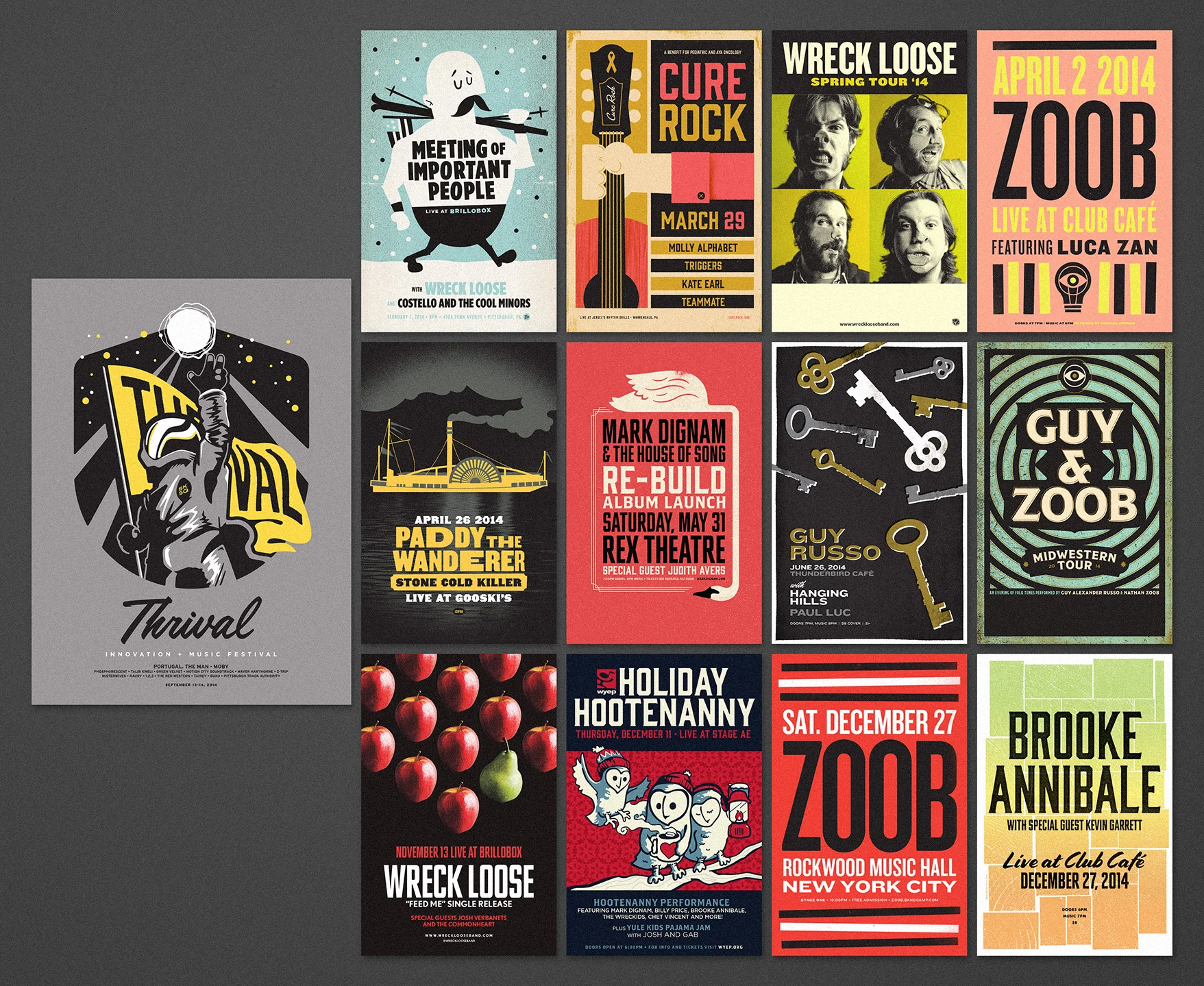
Thought it would be interesting to see all the posters I designed in 2014 side-by-side. Hoping to up my output in the coming year. The biggest challenge here was the Thrival spaceman poster, by far. A bit more involved than my normal body of work. I ended up pulling a heck of an all-nighter, taking me back to my college days. The most fun poster I worked on this year was the Wreck Loose Spring Tour poster, as chronicled in an earlier blog post. 

Onward.


Wednesday 12.31.14
Posted by Michael Artman
 

Album Packaging

I recently wrapped up a significant amount of design work on the new Wreck Loose singles, so I've got music on the mind. As the clock ticks past midnight, PBR in hand, there is no better time than now to do a bit of blogging on the top of album packaging.

Great artwork plays a subtle, yet major role in the perception of a great album. While I understand most folk's might not make the same blatantly aesthetic-driven musical choice that I make, on some sub-conscious level, good packaging informs that great care was put into the recordings stored within. If a band obviously splurges on making things look nice, imagine how much care they put into making it sound nice too.

I thought it might be fun to dig through the record collection and pull out a handful of my favorites. Do keep in mind I don't make any claims to have the most expansive collection of records, and furthermore, I am judging my picks based solely on the cover artwork. While packaging construction has a huge impact on perceived quality, it doesn't come across when in blog format. In no particular order, these are the best of what I've got my hands on:


Ghost on Ghost, Iron and Wine

I love how quirky Ghost on Ghost is. And I'm not talking about the sometimes awkward syncopation of Sam Beam's more recent music. The artwork riffs a bit on the weird relationship between frame and art. I can't help but see this as a fully realized illustration of the notion that sometimes the box really is better than its contents. Take that as you will, and proceed.


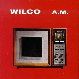
A.M., Wilco

A classic record with a classic design. Its no secret I am a fan of strong, bold colors and simple composition. This Wilco record is a prime example of not trying too hard. This sort of thing is easy to over-complicate, or over-glamorize. Yet it is perfectly spot on.


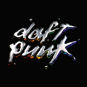
Discovery, Daft Punk

As iconic as it gets. Though quite visually similar to its predecessor, Homework, this one completely defines Daft Punk. It sets a precedence for all their future work. And on top of its strong graphic presence, its rendered impeccably well. Not only does it look like you can reach out and touch those beveled, metallic letterforms, it looks like they're going to make "bleepity-bloop" noises were you to press on them. Human robots, both in musicianship and visual execution. 
 

Now please, go forth and judge books by their covers. Its how people like me make a living.


Ghost on Ghost, Iron and Wine

Ghost on Ghost, Iron and Wine

A.M., Wilco

A.M., Wilco

Discovery, Daft Punk

Discovery, Daft Punk

Thursday 11.20.14
Posted by Michael Artman
 

Wreck Loose Tour Poster

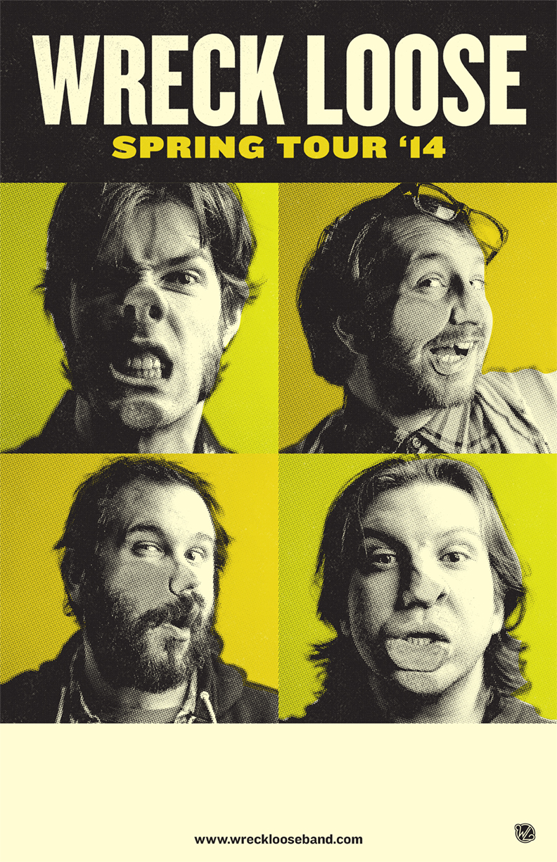
Every few hundred millennia, evolution leaps forward. I'd like to image mankind is in the midst of a great period of evolution, for I have no better way to explain the incredible musical talent of Wreck Loose, Pittsburgh rock n' roll gods with an unnatural gift for making piano keys scream out in unimaginable bliss. There be mutants among us, and we have no choice but to design their posters when they come a-knockin'.

For Wreck Loose's Spring Tour, the band wanted to take a bit of a step away from my normal illustrative work, in lieu of a more traditionally designed concert bill—but at the same time, it needed to command attention on venue walls frequently plastered with competing posters. Hence, I enlisted the creative prowess of photographer Noah Purdy, and we set up some lights for a long night of highly detailed art-direction, painstaking photography... and bourbon. It wasn't long before the bourbon took hold and Wreck Loose started... well, gettin' loose. 

Cruise on over to Wreck Loose's website and listen to their great debut EP, while I discreetly burn the negatives of the photos where Derek (top-right) got ahold of the cat. They cannot be unseen.

Dirty blown out halftones.

Dirty blown out halftones.

tags: Noah Purdy, Wreck Loose
categories: Pittsburgh, New Work
Monday 05.12.14
Posted by Michael Artman
 
Newer / Older

© 2010-2025 Michael Artman